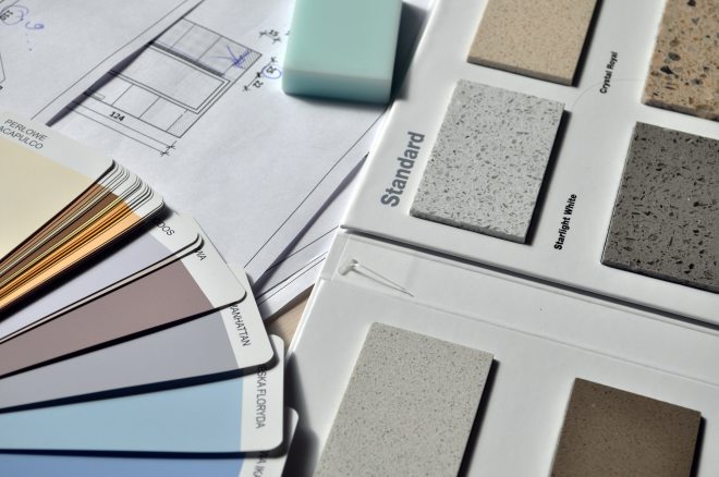
Choosing a color can be hard enough but changing the depth of the color can add warmth to any room.
The first thing to do is choose your color. Let’s say it’s a gray you are after. If there is a display strip of colors – all grays- light to dark. The lightest would be nice for furniture in the room. The lightest shade or white would be nice on the trim in a semi gloss finish. Look to the middle of the color strip for a wall color. Maybe a little lighter up the strip. Usually wall colors tend to fall about 3 or 4 colors down on the strip, however, every paint company is different so this is just guidance here, use your own judgement.
Keep in mind that a flat finish will hide imperfections on your walls like roller marks and will also be easily touched up. You can not wash flat paint very easily as it tends to shine if you scrub it as you are burnishing and buffing the flat dry surface. Normally we use an eggshell finish paint.
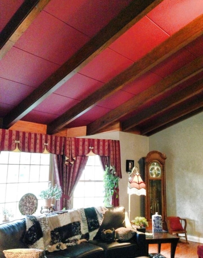
Ceilings are normally white flat. Lately textured ceilings are getting some shine to show off the texture, but we still paint most ceilings flat. Personally I love a color on the ceiling. Lighter walls and a warmer color on the ceiling. It’s that 5th wall you can have some fun with. Add a little drama by going darker. Choose the shade 2 below the wall color you chose. If your ceiling is 9′ or higher a darker color always looks great! Take that darker ceiling color into an adjoining room on the walls like a bathroom or dining room. A darker ceiling color makes the room feel more intimate.
Paint a table 2 shades darker than the wall color for a coordinating color and contrast.
I use these tricks every day in my job helping clients choose colors and deciding on which room to use them in. Keep in mind every color on the strip is simply a different shade of the same hue. You are assured to get great contrast and flow between each element and a neutral combination of shades that will go with almost anything you put in the room. Change shades from room to room for flow going up or down a shade on the paint strip.
Tami Loves…taking the fear out of choosing great color schemes for your home.

